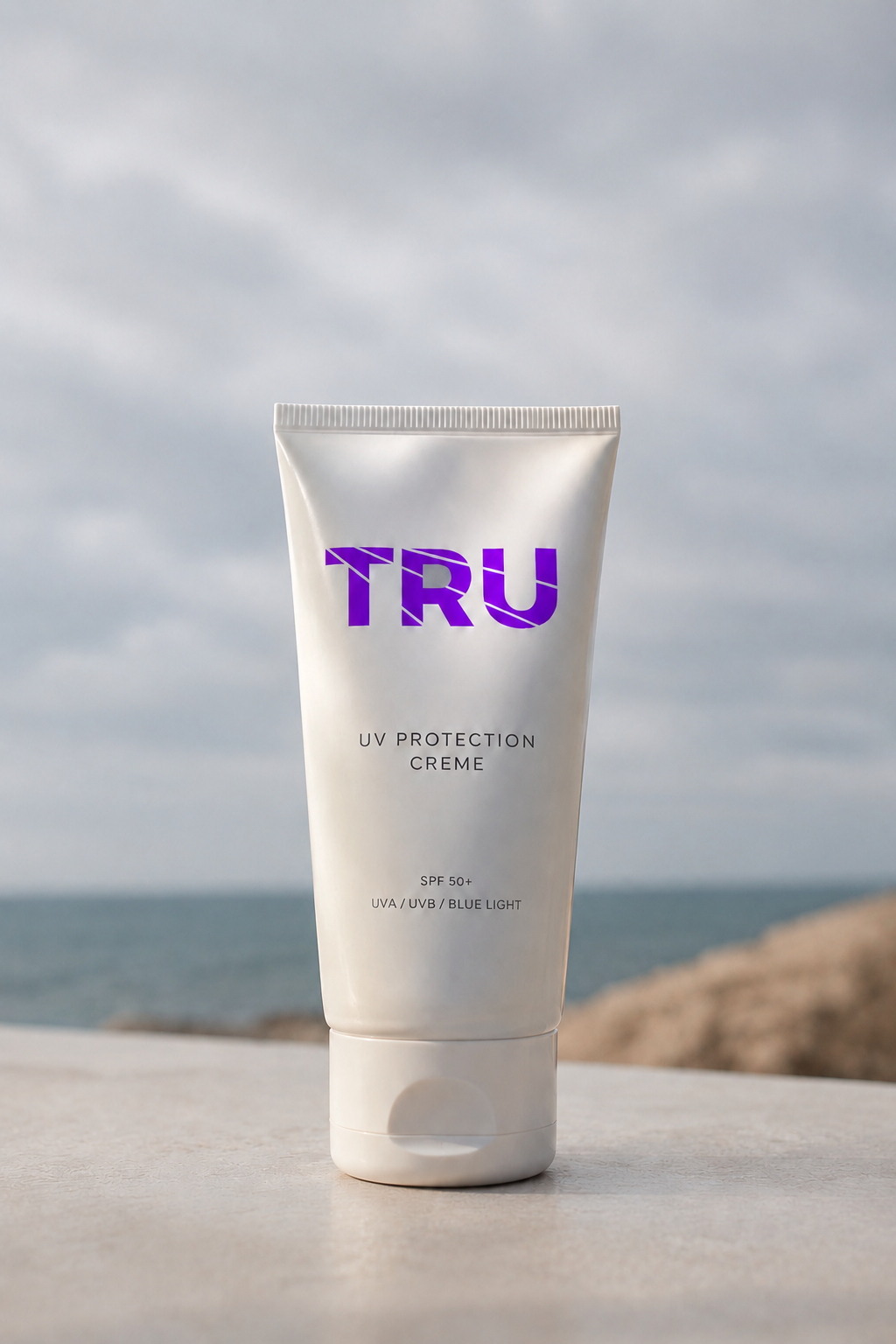
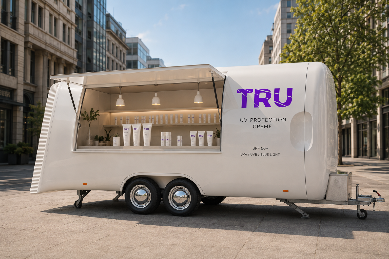
TRU: UV Protective Creme
Maastricht University commissioned the development of a campaign to raise awareness about the dangers
of UV radiation. The goal was to inform people about the necessity of protecting themselves better
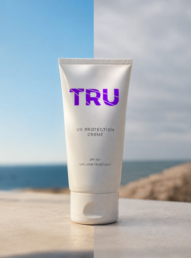
and more frequently against UV radiation—after all, UV radiation is always present, even when the
sun isn't shining.
Research
Following extensive research into UV radiation, the target audience, and related projects, I noticed
that most products are strongly sun-related. The name 'zonnebrand' (sunscreen/sunblock) implies that
protection is only necessary when the sun is shining. In reality, however, UV radiation is always
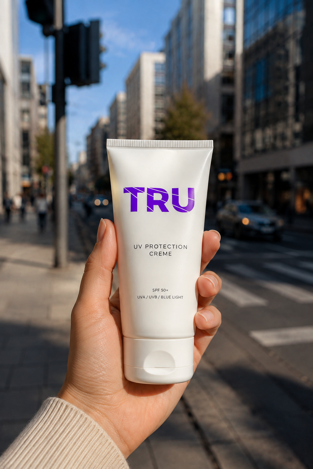
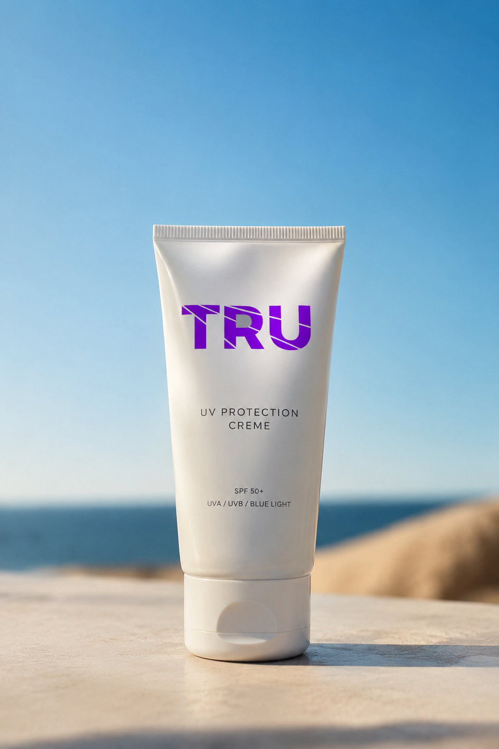
present—cloudy days included. For this reason, I chose not to label the product that protects
against UV radiation as a sunscreen, but as a UV protective cream.
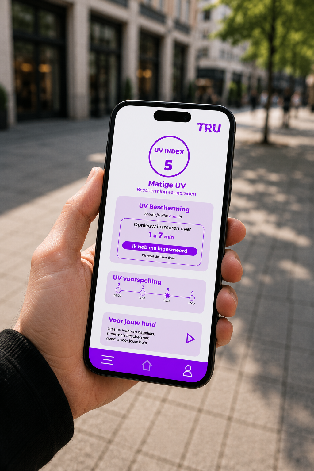
In addition, an app was
developed that displays the current UV index at any time of day and sends an alert when it is time
to reapply. The app is personalized, taking factors such as the user's specific skin type into
account.
I named the UV protective cream TRU. This name originated from a combination of the words ‘True’ and
‘Through’.
True represents the truth being communicated. Both the campaign and the app actively debunk
misconceptions and deliver factual information.
Through refers to how UV radiation penetrates through everything, even on overcast days. This
concept of radiation is also reflected visually in the logo design.
For the primary color of TRU, I ultimately chose violet, as this color aligns best with the concept
of ultraviolet and the invisible nature behind it. Blue and red were also tested as potential
options, but they felt less suited to the brand’s concept and overall aesthetic. Violet creates a
clear visual link to ultraviolet light while simultaneously setting the brand apart from more
conventional color choices.